On Apps, Geekery, and UI's

I am a total geek for beautifully designed apps. And to be perfectly frank I think most of them look like trash. Truth be told, my interface snobbery is of such an elevated degree that I make sweeping judgements on all manner of things based solely on how a thing looks. I judge a book by its cover and I own this fact with glee.
Much of this snootery is a luxury on account of the wide selection of apps. For example, I've been looking to get into mindfulness meditation. Ironically, I've been looking for an app to help, because I guess the phone is where all the answers are. There are many such apps, and a couple of real lookers. I can't express to you to the relief I felt upon finding out that the app I decided on had wonderful gradients and comforting typography. I kid you not!
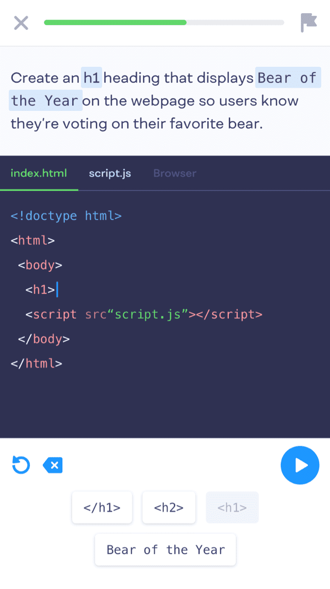
Anyway, as seemingly all things with me of late, I have yet to actually mention the origin of this story - the stunningly designed Mimo app.
Just feast on your eyes this:

Look at those bodaciously rounded corner. The soft grays and blues. I want to move in! And wait until you see the accent green!!
Load up the webpage or get the app and tell me your socks are still on!?
Laugh all you want. With the rotten state of things these days, beautiful design gives me comfort and calm. It nudges me gently towards a world filled with order and civility.
